A central page focuses on one dimension value at a time. When a central page is included in the script, links are automatically generated to it based on dimensions shared with other pages. These dimension values on other pages then become linked to the central page.
When the dimension value is clicked, the resulting central page is specific to the value followed from the previous page. The title of the central page reflects that dimension value. Due to this, central pages can only be accessed through other data area pages.
Central pages use a customizable, free-form layout.
Here is an ![]() example of a overview page, with the dimension value ARTESA indicated.
example of a overview page, with the dimension value ARTESA indicated.
Here is the ![]() resulting central page when the link is followed.
resulting central page when the link is followed.
Notice that the title, Corporate Brand: ARTESA, reflects the dimension name and the value being shown. A QuickView bar at the top of the page also shows the dimension name and the value. The QuickView allows the user to switch between different dimension values without returning to the previous page.
NOTE: This QuickView is not specified in the script, but is instead automatically generated by the central page.
Similar to overview pages, central pages have a free-form layout, but instead of looking at the information as a whole, central pages focus on one dimension value at a time.
A central page can display multiple sets of data by using multiple tabs to flip through different sets of information. Also, a central page can use multiple screens in concurrence with tabs to provide additional levels of detail and disperse the information across screens. By using tabs and screens, you can group sets of information together, especially when the information should not overcrowd the available space.
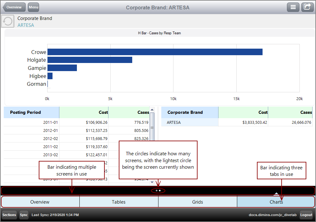
Here is an example of an ![]() central page that uses multiple tabs and screens, with the first tab, Overview, open.
central page that uses multiple tabs and screens, with the first tab, Overview, open.
Notice the black bar above the tab bar. The black bar indicates multiple screens, with each circle representing a different screen.
For more information, see What is a Tab Block?
A central page can use Table elements to display multiple tables of information at once. Central pages with Table elements work similarly to report pages but cannot add Rank, Percent, or Graph columns with the context menu.
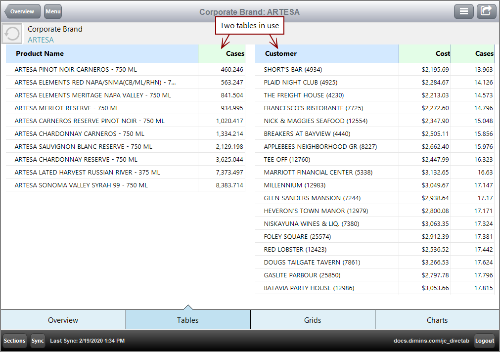
Here is an example of a ![]() central page using two tables.
central page using two tables.
For more information, see What is a Table?
Grids consist of rows that can specify the content and include links.
Here is an example of a ![]() central page using grids.
central page using grids.
For more information, see What is a Grid?
Charts are visual representations of the data.
- A bar-chart represents information with vertical bars.
- An hbar-chart represents information with horizontal bars.
- A line-chart represents information with a series of points on a graph with a connecting line.
- A pie-chart represents information with angular sections of a circle.
You can point to a line chart legend item to view only that line. Clicking the item reveals or conceals the associated line.
You can include a link to another page for the column attribute. If a parameter is included on the target page, the value selected is passed to the target page.
For Bar, H-Bar, and Line charts, the links are accessible through the chart values. For Pie charts, the links are accessible through the legend and chart values.
Here is an example of a ![]() central page using charts.
central page using charts.
For more information, see What is a Chart?
Boxes distinguish elements. They frame the contained element and provide a title.
Here is an example of a ![]() central page using a box around an H Bar chart.
central page using a box around an H Bar chart.
For more information, see What is a Box?


