A chart presents numeric information visually. You can use charts in either an overview or central page.
There are four types of charts:
- Bar charts
- H bar charts
- Line charts
- Pie charts
In their basic forms, the scripting for each of these chart types is similar.
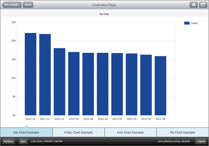
A bar chart uses vertical bars to represent numeric quantities of data.
Here is an ![]() example of a bar chart.
example of a bar chart.
Here is how this ![]() bar chart appears in the script.
bar chart appears in the script.
TIP: Use a sort-column and a first tag in the bar-chart block to identify top or bottom values. In this case, the top ten posting periods display.
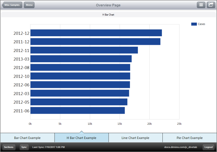
An h bar chart, or horizontal bar chart, uses horizontal bars to present numeric quantities of data.
Here is an ![]() example of an h bar chart.
example of an h bar chart.
Here is how this ![]() hbar-chart appears in the script.
hbar-chart appears in the script.
TIP: Notice that the hbar-chart is contained within a box element. This is because hbar-charts do not use the title tag, but you can use a box element title to label the hbar-chart.
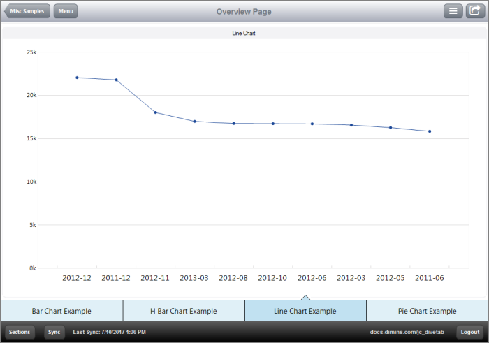
A line chart uses points on a graph and a line between them to show the relationship between numerical data values.
Here is an ![]() example of a line chart.
example of a line chart.
Here is how this ![]() line chart appears in the script.
line chart appears in the script.
Notice that the legend does not appear in the chart because the hide-legend tag is in use.
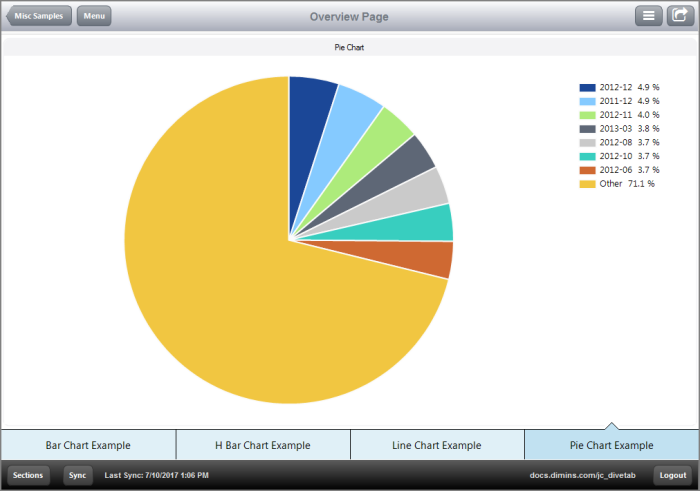
A pie chart uses percentages of a circle to show the relationship that numerical data values have to the total.
Here is an ![]() example of a pie chart.
example of a pie chart.
Here is how this ![]() pie chart appears in the script.
pie chart appears in the script.
See also:


