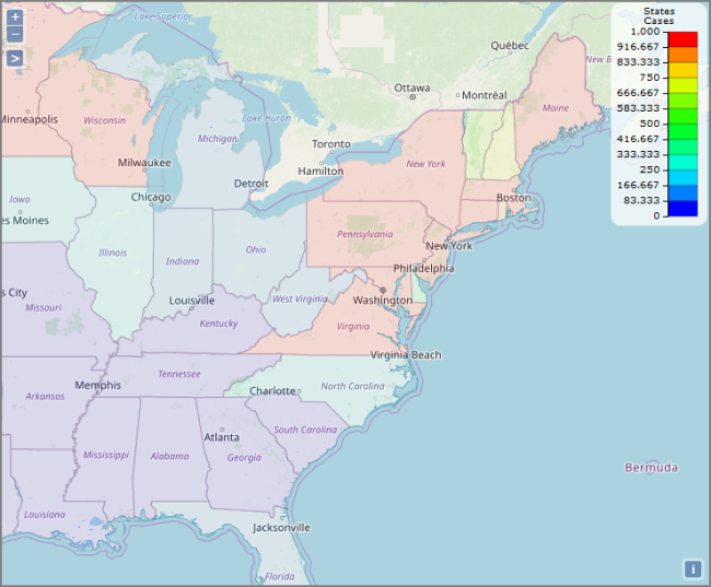
Boundary Map
Displays color-coded regions on the map based on the data.
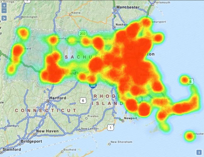
Heat Map
Displays color-coded areas of data density. The orange color in this example shows the most densely populated areas in Massachusetts.
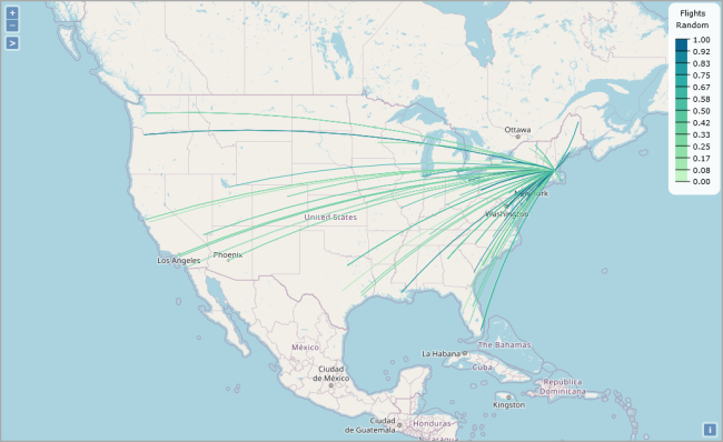
Line Map
Displays origin-destination data by drawing polylines or curved lines on a map. This example shows distance data between two transit stations.
NOTE: The underlying tabular must include columns with the following information:
- Source location in longitude-latitude format
- Target location in longitude-latitude format
- Unique identifiers/tooltips for each source/target location combination
- Summary
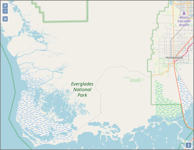
Point Map
Displays color-coded data points. This example shows New England population data.

Web Map Service Map
Displays web map services, such as traffic or weather maps. You can use a third-party open source or proprietary web map service.
DivePort allows you to include mutiple data layers on a map portlet. For ![]() example, a map can contain a boundary layer and a point layer.
example, a map can contain a boundary layer and a point layer.

See also: