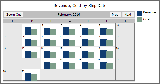
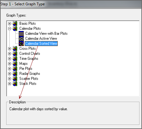
Calendar plot graphs are generated from a dive on data that is formatted as a date. They display all calendar days, including days that have no data associated with them.
There are three types of ProDiver calendar graphs:
The calendar view with bar plots shows bars (or points) representing the relative size of summary data on each day of the calendar.
To convert the contents of an active dive window to a calendar view with bar plots graph:
-
On the toolbar, click the Graph icon
 .
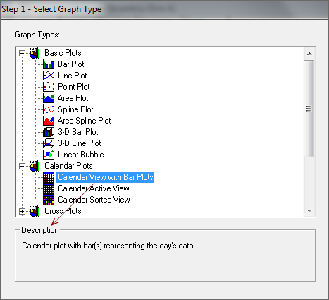
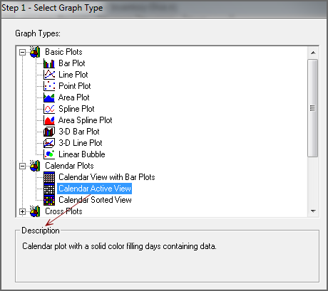
.The Select Graph Type
 dialog box opens. This is the first step in a graph creation wizard.
 TIP: Click a graph type to see a description in the Description box.
-
Double-click the Calendar View with Bar Plots graph type.
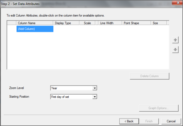
The Set Data Attributes
 dialog box opens.
 -
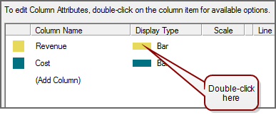
To add summary columns that you want to appear on the graph, double-click Add Column.
A list of available columns appears. You can select up to a total of 16 columns.
-
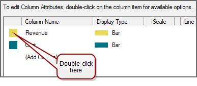
If you want to change one or more colors that display data on the graph, double-click the
 colored box in the left column, and select a different color from the list.
 -
If you want to change the display type for one or more columns, double-click the
 setting in the Display Type column, and select point from the list.
 -
If you are generating a point graph, you can change the point shape and size by double-clicking the settings in the Point Shape and Size
 columns, and selecting different options.
 -
The Zoom Level determines the time frame initially displayed on the calendar:
- Day—Shows data for one day at a time, starting with the earliest date in the dimension
- Month—Shows data for one month at a time, starting with the earliest month in the dimension
- Year—Shows data for one year at a time, starting with the earliest year in the dimension
- All—Shows all data for all time in the dimension
-
The Starting Point determines the day, month, or year the calendar displays initially:
- First day of set—Starts the calendar using the earliest date in the dimension
- First selected day—Starts the calendar using the earliest date in a selected row
- Last day of set—Starts the calendar using the latest date in the dimension
- Current Viewed—Starts the calendar using the date range that you are currently viewing
- If you want to further customize the graph, click Graph Options. Otherwise, click Finish to view the graph.
For more information, see Selecting Graph Options.
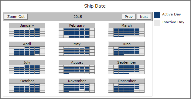
The calendar active view shows whether or not summary data is available for each day. You do not need to specify a summary column. ProDiver automatically uses all summary data.
To convert the contents of an active dive window to a calendar active view graph:
-
On the toolbar, click the Graph icon
 .
.The Select Graph Type
 dialog box opens. This is the first step in the graph creation wizard.
 TIP: Click a graph type to see a description in the Description box.
-
Double-click the Calendar Active View graph type.
The Set Data Attributes
 dialog box opens.
 -
The Zoom Level determines the time frame initially displayed on the calendar:
-
Day—Shows data for one day at a time, starting with the earliest date in the dimension
-
Month—Shows data for one month at a time, starting with the earliest month in the dimension
-
Year—Shows data for one year at a time, starting with the earliest year in the dimension
All—Shows all data for all time in the dimension
-
-
The Starting Point determines the day, month, or year the calendar displays initially:
-
First day of set—Starts the calendar using the earliest date in the dimension
-
First selected day—Starts the calendar using the earliest date in a selected row
-
Last day of set—Starts the calendar using the latest date in the dimension
-
Current Viewed—Starts the calendar using the date range that you are currently viewing
-
-
If you want to further customize the graph, click Graph Options. Otherwise, click Finish to view the graph.
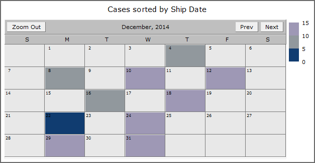
The calendar sorted view is color-coded to show a range of values.
To convert the contents of an active dive window to a calendar sorted view:
-
On the toolbar, click the Graph icon
 .
.The Select Graph Type
 dialog box opens. This is the first step in the graph creation wizard.
 TIP: Click a graph type to see a description in the Description box.
-
Double-click the Calendar Sorted View graph type.
The Set Data Attributes
 dialog box opens.
 -
In the Data Attribute 1 box, select a summary column that you want to appear on the calendar.
-
The Zoom Level determines the time frame initially displayed on the calendar:
-
Day—Shows data for one day at a time, starting with the earliest date in the dimension
-
Month—Shows data for one month at a time, starting with the earliest month in the dimension
-
Year—Shows data for one year at a time, starting with the earliest year in the dimension
All—Shows all data for all time in the dimension
-
-
The Starting Point determines the day, month, or year the calendar displays initially:
-
First day of set—Starts the calendar using the earliest date in the dimension
-
First selected day—Starts the calendar using the earliest date in a selected row
-
Last day of set—Starts the calendar using the latest date in the dimension
-
Current Viewed—Starts the calendar using the date range that you are currently viewing
-
-
If you want to further customize the graph, click Graph Options. Otherwise, click Finish to view the graph.
For more information, see Selecting Graph Options.
