When you transform data in the active dive window to graphical format, you specify attributes that determine how the data is presented.
Typically, a graph shows values for one dimension, and one or more columns (summary data), but some graphs can show more than one dimension.
The first dimension is what you are diving on. In the following example,
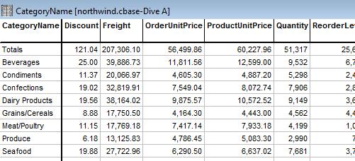
If the graph type supports more than one dimension, you specify the other dimension
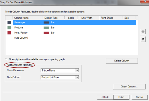
You can select a summary as the y-axis measurement when you create the graph. In this example,
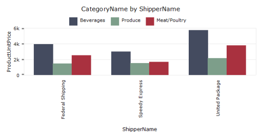
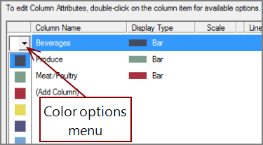
You can change the graph appearance by double-clicking on a column item in the edit dialog. For example to change a bar color, double-click the colored box in the left column. Or to change the display type, click an item in the Display Type column.
A list provides available options.

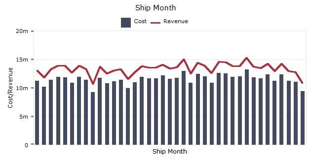
Bar, line, and point representations can be combined on a graph providing that the total number of plots is 16 or fewer.
You can combine multiple display types
To refine the graph further, click Graph Options which opens the Graph Options dialog box.
See also: