Options
Background portlet properties depend on the type of background portlet that you are using.

| Option | Description |
|---|---|
| Type |
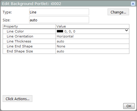
dentifies the type of background portlet (in this case, Line). |
| Change |
Opens the Select a Background Type dialog box, which you can use to select a different type of background portlet. |
| Size |
Sets the length of the line in pixels. The default is auto, which sizes the line to match the Portlet size in a manual layout. Resizing the Portlet also resizes the line. |
| Line Color |
Sets the color of the line in RGB format. The default is 0, 0, 0 (black). |
| Line Orientation |
Sets the line orientation. The default orientation is Horizontal. Other options are Vertical, Diagonal Falling, or Diagonal Rising. |
| Line Thickness |
Sets the thickness of the line, in pixels. The default, auto, has a value of 2. |
| Line End Shape |
Specifies whether arrows appear at either end of the line. The default is None. Other options are Arrow Left, Arrow Right, or Arrow Both. |
| End Shape Size |
Sets the size of the arrow head, in pixels. If the Line End Shape is set to None, this option has no effect on the appearance of the line. The default, auto, has a value of 15. However, if the line thickness setting is greater than this setting, any line end shape arrows appear wider than the line. |
| Click Actions |
Opens the Add Click Action dialog box, which you can use to add click actions to the portlet. |

| Option | Description |
|---|---|
| Type |
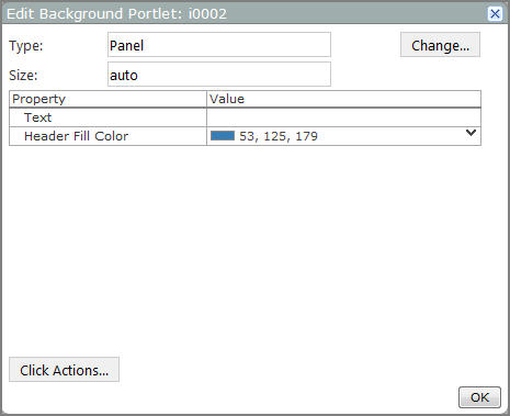
Identifies the type of background portlet (in this case, Panel). |
| Change |
Opens the Select a Background Type dialog box, which you can use to select a different type of background portlet. |
| Size |
Specifies the size of the panel, in pixels. Use the format w h, where w is the width and h is the height. The default is auto, which sizes the panel to match the portlet size. |
| Text | Specifies the header label. Text is white by default. |
| Header Fill Color |
Specifies the color of the header background in RBG format. The default value is 53, 125, 179 (blue). |
| Click Actions |
Opens the Add Click Action dialog box, which you can use to add click actions to the portlet. |

| Option | Description |
|---|---|
| Type |
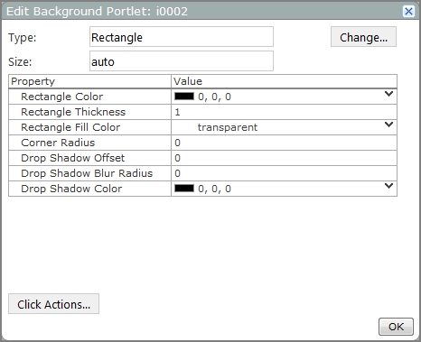
Identifies the type of background portlet (in this case, Rectangle). |
| Change |
Opens the Select a Background Type dialog box, which you can use to select a different type of background portlet. |
| Size |
Specifies the size of the rectangle, in pixels. Use the format w h, where w is the width and h is the height. The default, auto, sizes the rectangle to match the portlet size. |
| Rectangle Color |
Specifies the color of the rectangle edge. The default is 0, 0, 0 (black). |
| Rectangle Thickness |
Sets the thickness in pixels of the rectangle edge. The default is 1. |
| Rectangle Fill Color |
Specifies the color inside the rectangle edge. The default is transparent. |
| Corner Radius |
Specifies the degree to which the corners of the rectangle are rounded. The default, 0, draws the rectangle with right-angle corners. Higher values produce more rounded corners. For example, a corner radius of 5 starts the curve 5 pixels from each corner. |
| Drop Shadow Offset |
Creates a drop shadow to the right and down from the rectangle, of the size specified in pixels. The default, 0, eliminates any drop shadow. |
| Drop Shadow Blur Radius |
Causes a blur effect for the shadow. The default, 0, draws a drop shadow with a solid edge. Other values cause a blur effect to spread out from the drop shadow to the specified number of pixels. For example, if the blur radius is 3, the blur extends 3 pixels from the edges of the rectangle. If the shadow is offset, the blur is also offset. |
| Drop Shadow Color |
Specifies the color of the drop shadow and blur. The default is 0, 0, 0 (black). |
| Click Actions |
Opens the Add Click Action dialog box, which you can use to add click actions to the portlet. |

| Option | Value |
|---|---|
| Type |
Identifies the type of background portlet (in this case, Text). |
| Change |
Opens the Select a Background Type dialog box, which you can use to select a different type of background portlet. |
| Size |
Specifies the width and height of the text object, in pixels. Use the format w h, where w is the width and h is the height. The default is auto, which matches the size of the text box to the size of the portlet. |
| Text |
Specifies the text that displays. Use <br> tags to add line breaks. |
| Text Font |
Specifies the font style and size of the text. The default is Verdana 10 point bold. |
| Text Color |
Specifies the color of the text. The default is 0, 0, 0 (black). |
| Justification |
Specifies the vertical alignment of the text. The default is Left. Other options are Center and Right. |
| Vertical Justification |
Specifies the horizontal alignment of the text. The default is Center. Other options are Top and Bottom. |
| Rotation |
Specifies the direction of rotation for the text. The default is None, which sets the text horizontally reading from left to right. Other options are Clockwise or Counterclockwise which rotate the text 90 degrees. |
| Underline Color |
Specifies the color of the text underline. The default is transparent, which means that the text has no visible underline. Selecting a color underlines the text in that color. |
| Background Color |
Specifies the color of the portlet background. The default is transparent. |
| Click Actions |
Opens the Add Click Action dialog box, which you can use to add click actions to the portlet. |
See also: