Overview Page Code Sample
The  following code sample determines the basic layout and positioning of the elements for a simple overview page.
  overview-page {
    title "Overview Sample 1"
    cplan "/cplans/basic_timeseries.cplan"

    tab "Example 1 - one screen" {
      screen {
        layout {
          vsplit {
            hsplit percent = 40 {
              spacer percent = 10
              line percent = 1
              element id = "gddimensions" percent = 20
              line percent = 1
              element id = "gddimcount" percent = 8
              element id = "pie-chart" percent = 50
              spacer percent = 10
            }
            line percent = 1
            hsplit percent = 59 {
              spacer percent = 5
              element id = "bar-chart" percent = 90
              spacer percent = 5
            }
          }
        }
      }
    }
  }
The overview page is defined in the sections or pages block.
NOTE: The total percentage of the display layout elements within a vsplit or an hsplit must equal 100.
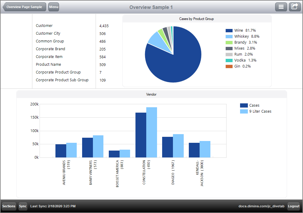
Here is the  results of the code in DiveTab.

Notice the hsplit block nested in the vsplit block. The major horizontal split is 40% on the top and 59% on the lower section of the screen, with a 1% dividing line, together totaling 100%. Within the horizontal split divisions, spaces, lines and elements are listed. These appear right to left in the specified space. For example, the top 40% split has a spacer, followed by a line, a grid, a line, another grid, a line, and a pie chart. The grids and pie chart are considered elements.
The  following code sample creates and identifies the elements used in an overview page. They are contained in an elements block.
  elements {

    grid id = "gddimensions" {
      row
      row "Customer"
      row "Customer City"
      row "Common Group"
      row "Corporate Brand"
      row "Corporate Item"
      row "Product Name"
      row "Corporate Product Group"
      row "Corporate Product Sub Group"
    }

    grid id = "gddimcount" {
      row
      row {
        text column = "Customer Count" {
          justification "left"
        }
      }
      row {
        text column = "Customer City Count" {
          justification "left"
        }
      }
      row {
        text column = "Common Group Count" {
          justification "left"
        }
      }
      row {
        text column = "Corporate Brand Count" {
          justification "left"
        }
      }
      row {
        text column = "Corporate Item Count" {
          justification "left"
        }
      }
      row {
        text column = "Product Name Count" {
          justification "left"
        }
      }
      row {
        text column = "Corporate Product Group Count" {
          justification "left"
        }
      }
      row {
        text column = "Corporate Product Sub Group Count" {
          justification "left"
        }
      }
    }

    pie-chart id = "pie-chart" {
      title "Cases by Product Group"
      dimension "Corporate Product Group"
      column column = "Cases"
    }

    bar-chart id = "bar-chart" {
      title "Vendor"
      dimension "Vendor"
      bar column = "Cases"
      bar column = "9 Liter Cases"
    }
  }
If two screens are defined, they present with a line in the footing showing two dots.
Here is  another code sample for an overview page that has two screen blocks.
divetab version = "0.0" {
  definitions {
    elements {

      grid id = "dimensions" {
        row
        row "Product Names"
        row "Customers"
      }

      grid id = "dimcount" {
        row
        row {
          text column = "Product Name Count" {
            justification "left"
            link {
              page id = "report-product"
            }
          }
        }
        row {
          text column = "Customer Count" {
            justification "left"
            link {
              page id = "report-customer"
            }
          }
        }
      }

      hbar-chart id = "hbar-chart" {
        dimension "Vendor"
        bar column = "Cost"
        bar column = "Net Sales"
        bar column = "Discount"
      }

      line-chart id = "line-chart" {
        title "Posting Period"
        dimension "Posting Period"
        line column = "Cost"
        line column = "Discount"
        line column = "Net Sales"
      }

      table id = "table" {
        dimension "Corporate Product Sub Group"
        text column = "Cases" {

          low-color "c91804"
          high-color "2dbd28"
          low-threshold 1000
          high-threshold 5000
        }
      }
    }
  }

  data-area id = "overview-page" {
    title "Overview Sample 2"
    icon "/divetab/images/trends-322-178.png"
    sections {

      overview-page {
        title "Overview Sample 2"
        cplan "/cplans/basic_timeseries.cplan"

        tab "Example" {
          screen {
            layout {
              vsplit {
                spacer percent = 5
                line percent = 1
                hsplit percent = 15 {
                  spacer percent = 22
                  line percent = 1
                  line percent = 1
                  element id = "dimensions" percent = 20
                  line percent = 1
                  line percent = 1
                  element id = "dimcount" percent = 30
                  line percent = 1
                  line percent = 1
                  spacer percent = 22
                }
                line percent = 2
                hsplit percent = 75 {
                  element id = "line-chart" percent = 100
                }
                spacer percent = 2
              }
            }
          }

          screen {
            layout {
              vsplit {
                box {
                  title "Vendor and Corporate Product Info"
                  hsplit {
                    vsplit percent = 40 {
                      element id = "table"
                    }
                    vsplit percent = 60 {
                      element id = "hbar-chart"
                    }
                  }
                }
              }
            }
          }
        }
      }
    }

    pages {
      report-page id = "report-product" {
        title "Expand"
        cplan "/cplans/basic_timeseries.cplan"

        dimension "Product Name"

        text column = "Cases" {
          expand "Past Years 101" {
            text "Cases Y" column = "Cases Y"
            text "Cases Y-1" column = "Cases Y Y-1"
            text "Cases Y-2" column = "Cases Y Y-2"
            text "Cases Y-3" column = "Cases Y Y-3"
          }
        }
      }

      report-page id = "report-customer" {
        title "Expand"
        cplan "/cplans/basic_timeseries.cplan"

        dimension "Customer"

        text column = "Cases" {
          expand "Past Years 101" {
            text "Cases Y" column = "Cases Y"
            text "Cases Y-1" column = "Cases Y Y-1"
            text "Cases Y-2" column = "Cases Y Y-2"
            text "Cases Y-3" column = "Cases Y Y-3"
          }
        }
      }
    }
  }
}
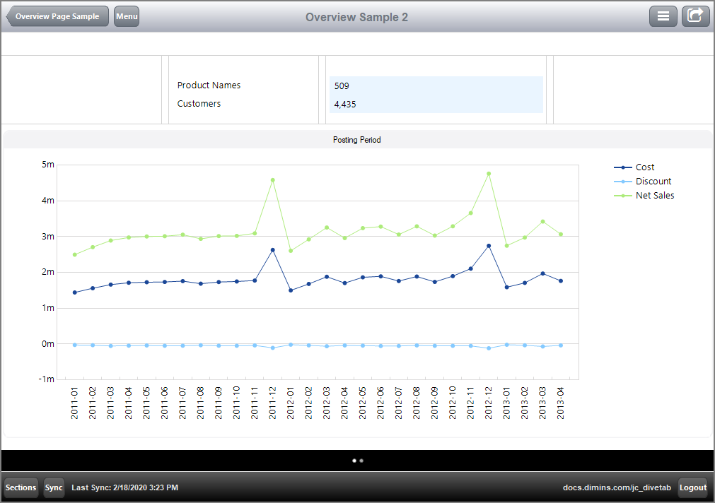
Here is the  result of the code for the first screen in DiveTab.

Notice that there is more segmentation of the top section.
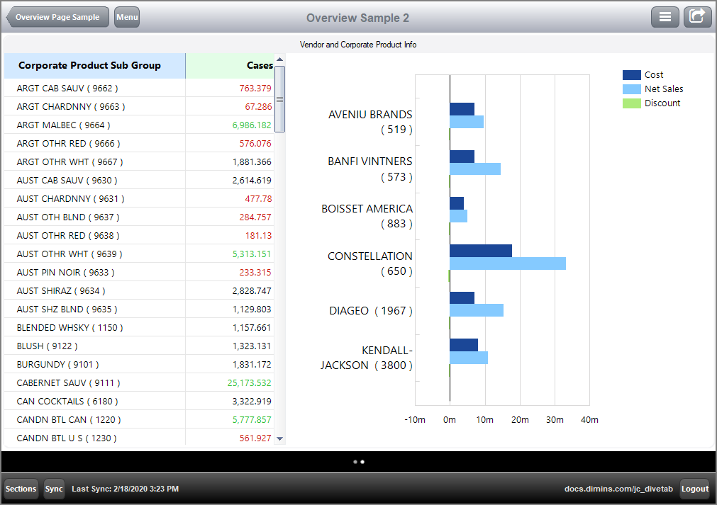
Here is the  result of the code for the second screen in DiveTab.

See also:
![]() following code sample determines the basic layout and positioning of the elements for a simple overview page.
following code sample determines the basic layout and positioning of the elements for a simple overview page.![]() results of the code in DiveTab.
results of the code in DiveTab.![]() following code sample creates and identifies the elements used in an overview page. They are contained in an elements block.
following code sample creates and identifies the elements used in an overview page. They are contained in an elements block.![]() another code sample for an overview page that has two screen blocks.
another code sample for an overview page that has two screen blocks.![]() result of the code for the first screen in DiveTab.
result of the code for the first screen in DiveTab.![]() result of the code for the second screen in DiveTab.
result of the code for the second screen in DiveTab.