About Waterfall Charts
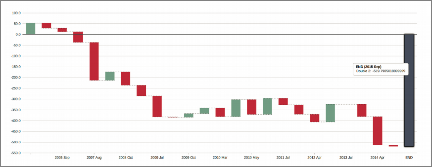
A waterfall chart shows cumulative changes of a single value. By default, positive changes are shown as a green bar and negative changes are shown as a red bar. Each bar starts where the previous bar ends, and dotted lines connect the bars. A blue bar shows the final, or total change from start to end.

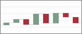
Close up view

Waterfall chart options
When you create a waterfall chart, you specify:
- A dimension (often a date type)
- A numeric value column
Optionally, you can customize colors for the Total, Up, and Down bars, and the label for the end value bar.
Axes settings allow you to alter the horizontal axis label and vertical axis scale.
See also Chart Portlet Options.