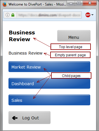
You can create one or more mobile environments that are optimized for viewing with smartphones. When you use a smartphone to log on to your portal, DivePort displays the  first page in an environment that has the Mobile Mode option set to Smartphone Browser by default. The names of the child pages for that page are
presented as vertical tiles. To view a list of all top-level pages, tap Menu.
first page in an environment that has the Mobile Mode option set to Smartphone Browser by default. The names of the child pages for that page are
presented as vertical tiles. To view a list of all top-level pages, tap Menu.
NOTE: Optionally,
When working with mobile environments consider the following:
- You can create more than one mobile environment, but their order in the environment list is significant. A smartphone user can only see the first environment that has the Mobile Mode property set to Smartphone Browser.
- Users cannot switch environments in the mobile view. If you want to create one mobile environment for one group of users, and a different mobile environment for another group of users, you must set access controls at the environment level to ensure that each group has access to the correct mobile environment only.
- Although all DivePort page layouts are available, it can be preferable to place only one portlet instance per page. Consider the screen size when selecting data that you want to be available to your smartphone users.
- Mobile-specific skin attributes can be found in each of the text files under webapps\<diveport>\customization-templates\skin.
- DivePort uses HTML5 Canvas (excanvas.js) to display graphics. This ensures that indicators, background, and measures portlets, and clickable graphs display as intended on mobile devices.
-
Because your main and mobile sites are in two different environments in the same portal, you cannot log in to the portal main site with your smartphone. However, if necessary, you can view the main site in non-mobile mode from a smartphone by adding the mobileMode=false parameter to the URL.
For example, if your DivePort site is at https://example.com/DivePort, enter https://example.com/DivePort#mobileMode=false on your smartphone to view the portal interface in standard (not mobile) mode.
If you are viewing a specific page, such as https://example.com/ DivePort#page=a0100, add & to the parameter, for example: https://example.com/DivePort#page=a0100&mobileMode=false