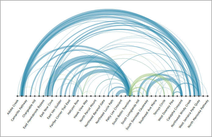
About Arc Charts
Arc charts display nodes as circles on a single axis, and arcs to show connections between source and target nodes (origin and destination). The thickness of the arc is determined by a numeric column, the color specifies the direction being traveled, and the height specifies distance between nodes.
Commonly used in the travel industry, source and target nodes show the source and destination of the route traveled.

Arc chart options
When you create an arc chart, you specify:
- A source column
- A target column
- A numeric value column
If you are using a dive or marker as a source, it must have exactly two dimensions.
Nodes listed in the source column appear in natural sort order (alphabetical or by numeric value) or as sorted by the data source. Target nodes that are not listed in the source column appear after the list of source nodes.
TIP: If a target node does not appear in the source column, you can add it to the source column without any other impact by adding a row with the same source and target node and a blank (null) value. This enables all nodes on the arc chart to be sorted in natural sort order and also will allow you to apply a label to the axis using a Label column setting.
Reading an arc chart
- The thickness of the arc is determined by a numeric column, thicker arcs indicate higher value.
- The color of the arc specifies the direction being traveled.
- The height indicates distance between nodes.
Placing a pointer on an arc opens a tooltip that shows the labels for the source and target nodes, as well as the summary column value.
Placing a pointer on a node highlights the associated connections and shows Volume In and Volume Out data.
See also Chart Portlet Options.