Describing a Sample Dashboard
The following example describes the elements in a Measure Factory dashboard.
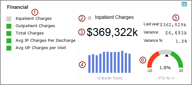
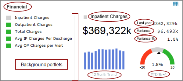
In this example, the dashboard consists of:

|
A matrix portlet showing billable fees. Each line item has an alert column and an associated click action that updates the rest of the dashboard to show data specific to that line item. |

|
An alert indicator portlet inferring if the selected matrix value is good (green), bad (red) or acceptable (gray) as compared to a previous value. |

|
A text indicator showing the summary value of the selected matrix line item. |

|
A chart portlet showing financial trends over the past year. Placing the pointer on a bar opens a tooltip that shows the month and summary value.
|

|
Three text indicators showing previous values and variance between this year and last year. |

|
A gauge indicator showing where the selected matrix value falls on a threshold scale. |
|
Various background portlets that separate or label portlets. |
|
|
Various click actions. |
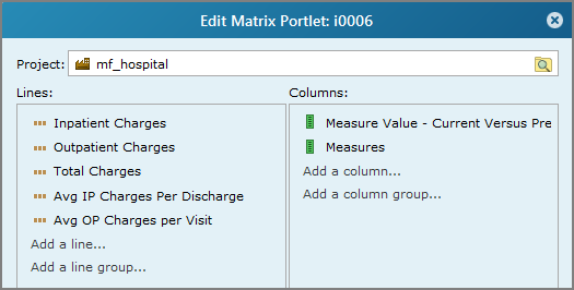
This matrix portlet has two columns and five lines (rows). It also has a row-scoped crosslink click action that makes the dashboard interactive.
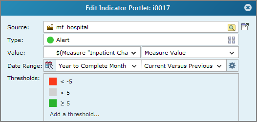
This alert indicator shows a color-coded shape that informs the user if the selected measure value meets, surpasses, or fails to meet specific threshold levels in a specified date range and time period.
In this case, the measure value is specified as a Measure Factory macro. The summary of the current year's Year to Complete Month date range is compared to the summary of the same date range for the previous year, and the percent difference is calculated. The goal is to increase the value by at least 5%, however 0 ±5% is acceptable. The resulting threshold value (1.8%) is in the mid-range (gray), and the shape setting is set to Square.
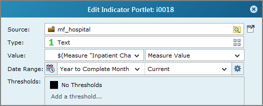
This text indicator shows the summary value of the specified measure.
In this case, the measure value is specified as a Measure Factory macro. It displays the summary of the current year's Year to Complete Month date range. The Text settings defines the font as 36px Arial with Left justification. There is also a portal and row-scoped portal page click action that links to the Default Analysis portlet.
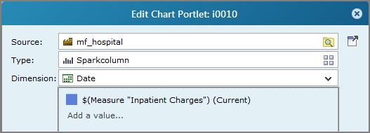
This chart shows the monthly charges for the past year.
In this case, the date settings define the span as Rolling Year by Month, the period as Month and the label format as MMM. There is also a row-scoped portal page click action that opens the Default Analysis portlet, specific to the month on the bar.
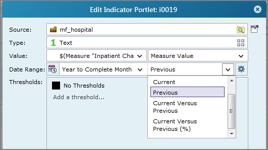
The first of the set of three text indicator portlets shows the summary value of the specified measure for the Previous time period. The other two indicators in this set show the difference between the Current Versus Previous value, and the percent difference between them (Current Versus Previous %). The Text settings defines the font as 16px Courier New with Right justification. The first two also have a portal and row-scoped portal page click action that links to the Default Analysis portlet.
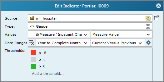
This gauge shows where the selected value falls on the threshold scale.
This dashboard uses seven text background portlets to label data as well as a line background portlet to separate the matrix portlet from the other sections.
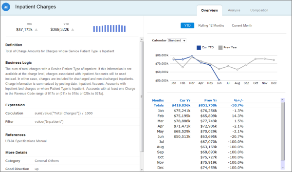
In addition to click actions in individual portlets, there is a portlet-scoped click action that links to the ![]() Measure Overview page. It is accessed from an image portlet located on the upper right corner of the dashboard
Measure Overview page. It is accessed from an image portlet located on the upper right corner of the dashboard ![]() .
.

